This font was created for using in non-antialiased environment.
You may Download 7z-archive and use it freely (see "license" in archive).
First of all I switch off antialiasing everywhere where I can: in operating system settings, in user preferences, in applications.
Then, if I need monospace font, I choose MbbPro with one of the embedded sizes depending of the screen resolution and application:
| Point Size | Pixel Size | Screen Resolution (ppi) |
|---|---|---|
| 12 | 16 | 84 - 102 |
| 14 | 18 or 19 | 84 - 102 |
| 14 | 37 or 38 | > 200 |
Java uses size in pixels.
I have been ought to add 38-pixels bitmap. Qt Creator use it as a 14-point font on high resolutions.
38-pixels are copies of 37-pixel's pairs.
Now I use MacBook Pro with Retina display for everyday work. As was expected high resolution solved some problems with antialiasing, but not all sorts of them. Yes, I accept default fonts and settings for browsing; and no, I still don't accept "standard" fonts and settings for long-hours coding and reading/writing tech docs for my projects.
My main working OS is Windows, so I include 37-pixels bitmap: it is 14 point for 2880*1800 resolution with recommended sizing (zoom) in screen resolution settings.
37-pixels's symbols differ from smaller counterparts: some have serifs, some have curves on edges - things that are not possible in small sizes.
Besides new size I decided to do all new experiments with new font "MbbPro" (mbb programming). It has less symbols than "Mbb" - only ASCII and ISO-8859-5; it includes all bitmaps and glyphs from "Mbb", taking into account previous note; and it has not some inherent Mbb's problems, for example width's equality.
In December 2013 I added glyphs. They are not good, sorry, I am not a font designer. So why I did that? The answer is simple: we don't control all places in our systems that render fonts, so we can't switch off antialiasing everywhere we want. Example: Netbeans IDE 8.0 beta always showed antialiased text in the Code Completion window, so I saw black rectangles instead of method's names.
If we can't control all than we want workaround. Glyphs is workaround and only workaround at the moment.
Bad news is now you may not be absolutelly sure that you see non-antialiased text.
I use it on 102 ppi monitors.
It's required for some Windows programs. Sometimes you see 18 pixel size in font chooser dialog but really 19 pixel bitmap is used.
19 pixel symbols are mostly counterparts to 18 pixel.
Some 18 and 19 pixel symbols slightly differ in shapes compared to their 16 pixel counterparts. My intent is not to create consistent font from designer's perspective. My intent is very practical - create font for long everyday coding. Some shapes look good for 16 pixel size but ugly for 18 and vise versa, so I use most suitable (for me) in each case.
We can use more systems with high resolution for now than year or two ago. I mean for coding so I mention only three laptops (not smartphones):
1. Apple MacBook Pro with Retina display. 15", 2880*1800, 226 ppi.
2. Dell Precision with QHD+ display. 15.6", 3200*1800, 235 ppi.
3. Microsoft Surface Pro 3. 12", 2160*1440, 216 ppi.
These resolutions are near to theoretical limit of (about 300 ppi) human ability to distinguish between two nearby pixels.
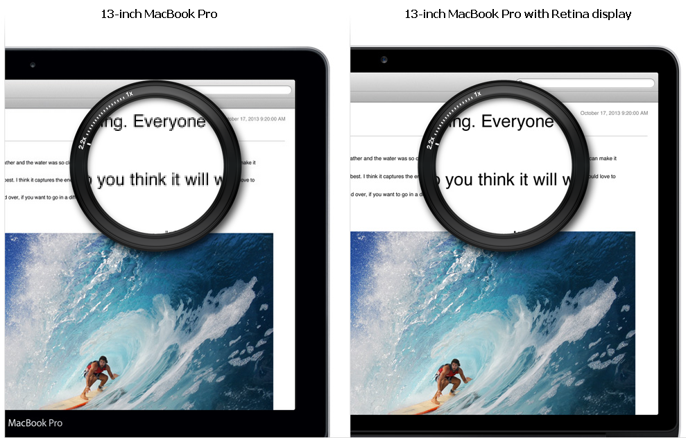
Fine. But lets go and look at Apple's page about Retina display. I have copied piece of subject just to see it here: 
On Retina display all things are more attractive. Yes, but look carefully at the text symbols under magnifier. Do you see gray pixels? It's antialiasing. It still pains eyes. But is it really useful on high resolution? Wouldn't text more clear without those gray pixels? I think so.
On low resolutions (left) antialiasing is awful. On high resolution (right) it is redundant. And it is what I name "Antialiasing Paradox":
The higher resolution is the less useful antialiasing is. And vice versa: the more you need antialiasing (on low resolutions) the worse it works.
This is trivial. Antialiasing on screen display is not universal. It may be useful only for some fields (for WYSIWYG text processing for example) and does not suit all people. Period.
This is the font that intended for using in non-antialised environments especially for programmers.
You may Download 7z-archive and use it freely (see "license" in archive).
1. It is TTF with embedded bitmap font into it.
2. It has no glyphs. More exactly all glyphs are the same - filled
   rectangles.
This has some consequences. Bad news is font is not scalable, you can use only embedded sizes, now only one size 16 pixels height. Good news is if you see letters not black rectangles you may be absolutelly sure that you see non-antialiased text.
3. It has ASCII symbols and Russian letters.
4. English and Russian and digits are in three slightly different styles.
Bad news is font is good for pure english or english+russian only. Good news is for russian programmers - you can distinguish between latin and russian letters and this makes life easier, trust me.
5. It was my intension to make font nice for long reading of the sources.
6. It has bold variant but not italic variant. It's hard to do good italic
   on low resolutions.
Enjoy.
When I started my work on mbb-font at the beginning of 2009 I was 44 and I thought that things are changing rapidly. I thought that after 2-3 years monitor resolutions will be about 200-300 ppi and it will be possible to use scalable fonts in my real programming process.
Now at the mid of 2013 I am 49 and I see that things are not changing so rapidly, I use the 96-ppi monitor at work and 102-ppi monitor at home. Of course there are many devices around me with 200-300 ppi and I have my own SurfacePro but my everyday programming environment is almost the same as 5 years ago.
Progress is slower than expected or it has not the same speed in all directions. The highest speed is in consumers' interests - at the moment this is mobile devices. But we, programmers, are not users. We have slightly different priorities. One of these - we need to work with texts on the screen hours and hours every day of weeks. And if users' priority is usually a reading speed we add reading accuracy.
On the other hand we don't really need scalability to read program sources. So we don't really need antialiasing.
And we don't need antialiasing because it pains our eyes. Yes, even Microsoft indirectly agreed with this fact. They told on one of MSDN forums that about 15% people feel uncomfortable with antialiased fonts. These are people mostly with good sight and they see every pixel at low ppi (up to 200).
Take care of your eyes.
Low percentage (15%) of us give some problems. First, it is very hard to explain others our problems with antialiased fonts. "But all use it, don't warry" - they say.
Second, vendors of software tools don't put this usability problem into first priority list. For example, VisualStudio 2012 uses WPF for rendering. And in editor window we always saw antialiased text apart from system's settings. In Update 1 things did not change. Only in Update 2 editor window takes into account system's settings. Now I see sharp perfect non-antialiased text. Thanks Microsoft.
So things are not much better than 5 years ago. That's why I created mbb-font that time and use it today for everyday programming. That's why I decided to explain.
I tried to implement:
- ASCII and Russian chars.

- Russian chars must be different from English chars. Almost all fonts do it
  conversely: use suitable English char for Russian if possible. For example
  use English char "c" [si:] for Russian char "с" [es]. This leads to subtle
  errors I know two of which. First, in printf operator:

  printf("%с", a_byte)

  You may type Russian "с" in format string. Code compile and run. You find
  error only by analysing program output. To find error on compile stage you
  must use some new compiler with special compiler options switched on or
  special tool like CppCheck.

  Second, in string literals. Suppose we have "Сolumn" literal in code and
  code filter text file with pattern matching. Matching is expecting on
  "Column-1", "Column-two" and so on. When matching doesn't work as expected
  where will you search errors? I spent some time on verifying patterns. But
  the course was Russian "С" in "Column" literal. It's not possible to have
  any tool to find error like this.

  Two examples are real. When I faced first I already used Mbb-font, so it
  tooked only seconds to catch error.

  See to keyboard, Russian "с" and English "c" are on the same button. It
  makes things worse.

- Russian chars differ form English chars and from Digits. This distinguish
  code itself from Russian comments, Russian string literals and number
  literals. Reading is faster and more correctly.

- There must be no "fat spots" in text. Fat spots - areas with enormous
  black pixels density - attract you glance and reduce reading speed.

- There must be at least one empty pixel between any two nearby symbols.
  Surprisingly many fonts violate this. Most annoying thing is when
  two__underscores meld.

- Common requirements about distinguish "1iIloO0".

- Tick "'" and backtick "`" must be symmetric but not the same.

- Centers (vertical) of the mathematical operations "+-=*" and of the colon
  ":" must be on equal high for good looking such combinations as ":=" or
  "+=".

- Punctuation with the dot ":,.;" must have "fat dots and commas" - for easy
  differ ":" from ";".

- Parens of all kinds, vertical bar and slashes must be as high as possible.

- Dots above Russian letters "ёЁйЙ" must be "fat" like in punctuation.I know few essays about subject. Most famous is Joel Spolsky's Three Wrong Ideas From Computer Science. Joel claims that "antialiased text just looks bad" but he doesn't reason why.
I think that problem is in "gray" pixels. When we see halftone image our brains try "to build" whole picture, eyes "scan" image more than once until brain signals "ok, I recognize it, it is an orange fox": 
With a magnifire we can see how this 16x16 pixels image looks in reality: 
Well, without halftones it would be impossible to paint that fox on 16x16 canvas.
But antialiasing does not help us for reading text. It does not add anything useful but force our brains and eyes still do the same job as while looking at pictures.
Let's look: 
We don't see text, we see picture, this is a fragment: 
When we read text we don't need any additional information about picture representing this text. All we need is: as fast as possible and as precise as possible recognize symbols and distinguish them one from another. We don't need antialiasing to perform this task. We need clear sharp symbols not halftones!